Good energy deserves great branding.
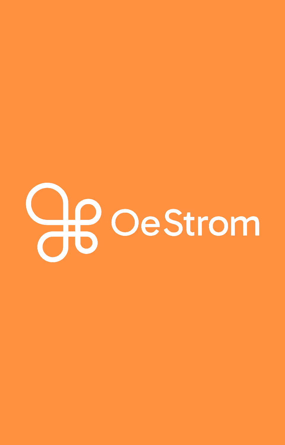
Logo Design
Visual Branding
Interaction concept
UX Design
UI Design
Development
Vincent Helmus
Account Manager
Lena Keck
Visual Design
Andreas Obenaus
Creative Concepter & Copywriter
Matthias Schöllhorn
Visual Design
With OeStrom, a citizen energy community emerges as an innovative answer to an electricity market that feels confusing and uncertain for many.
A complex market needs simple clarity.
For many households and small businesses, the electricity market is difficult to navigate: fluctuating prices, hard-to-compare offers, and new models like citizen energy communities that most people are still unfamiliar with.
Our goal was clear: explain complex topics in a simple way, build trust through transparency, and bring people together in an energy community — as intuitively as possible.
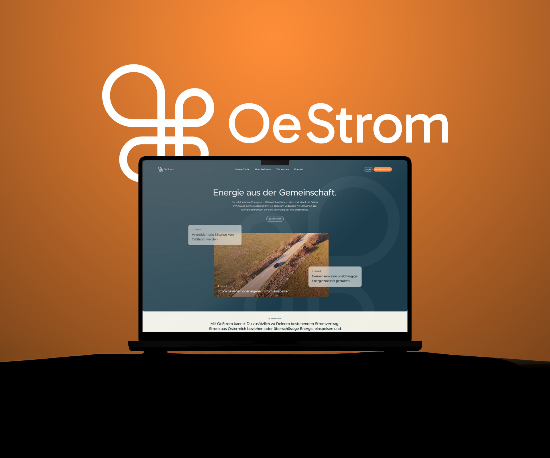
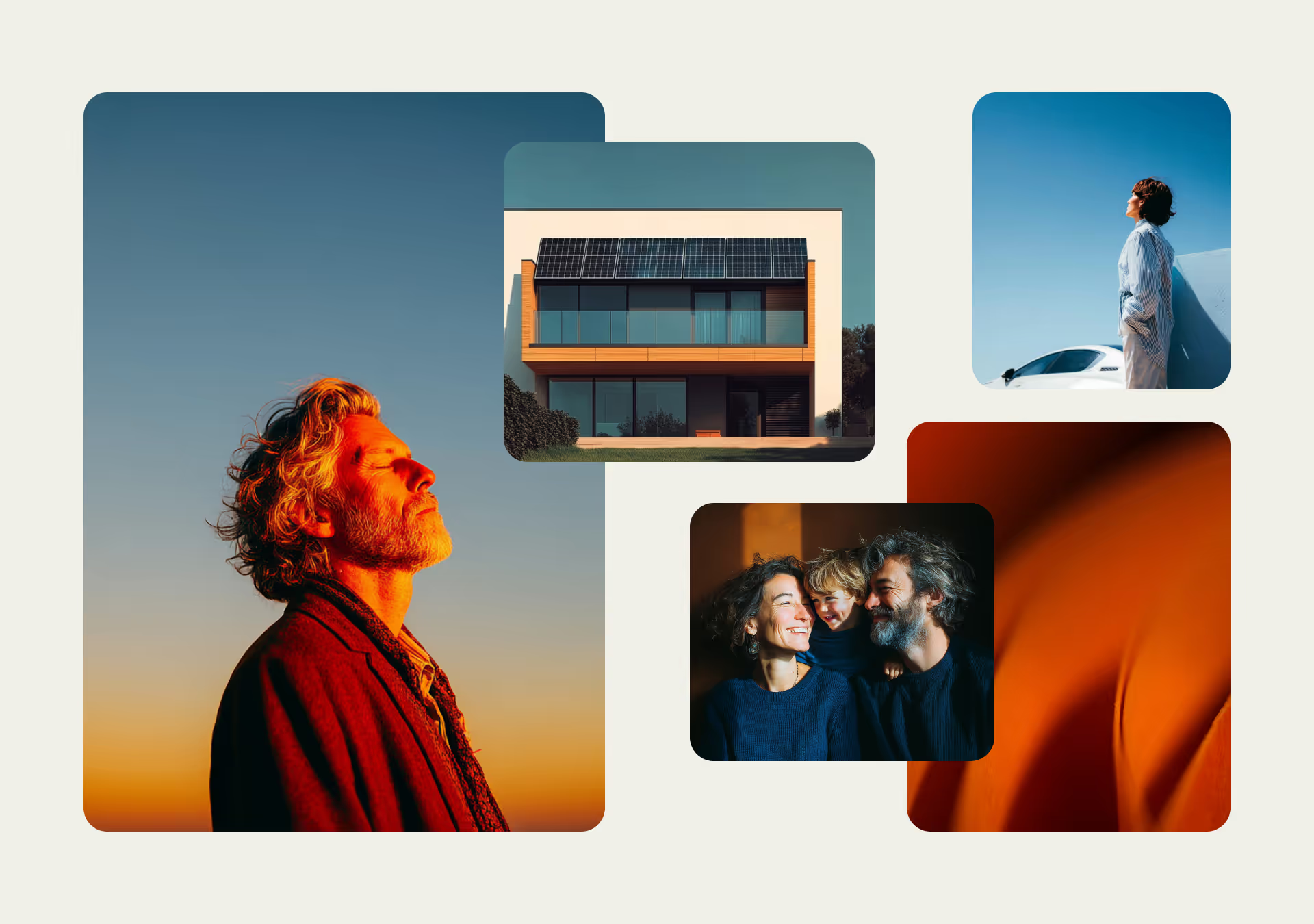
From energy systems to a brand that builds trust and community.
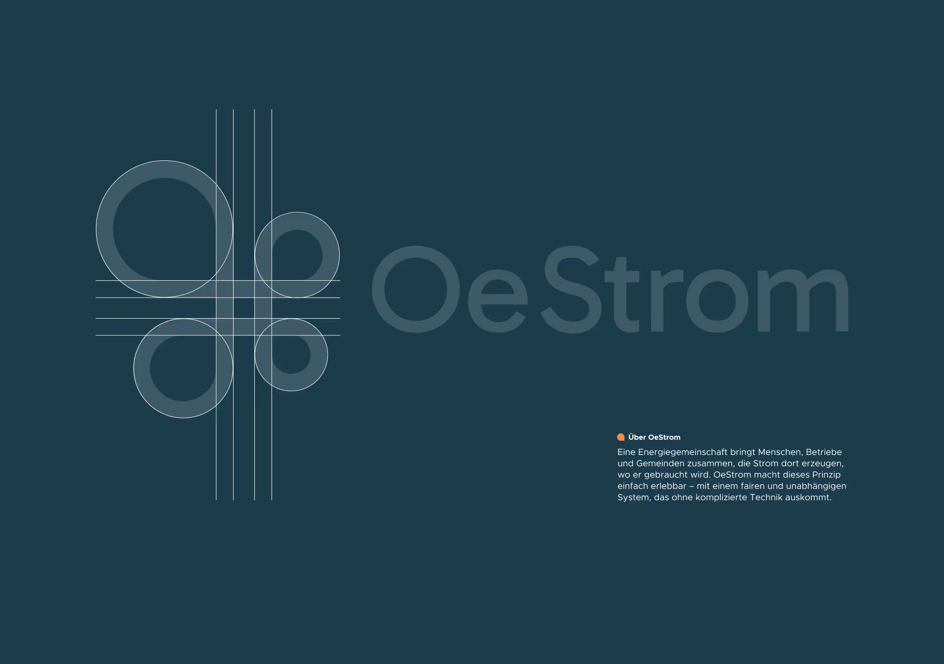
In an environment that feels technical, regulated, and often lacking emotion, we needed a visual identity that provides both clarity and trust.

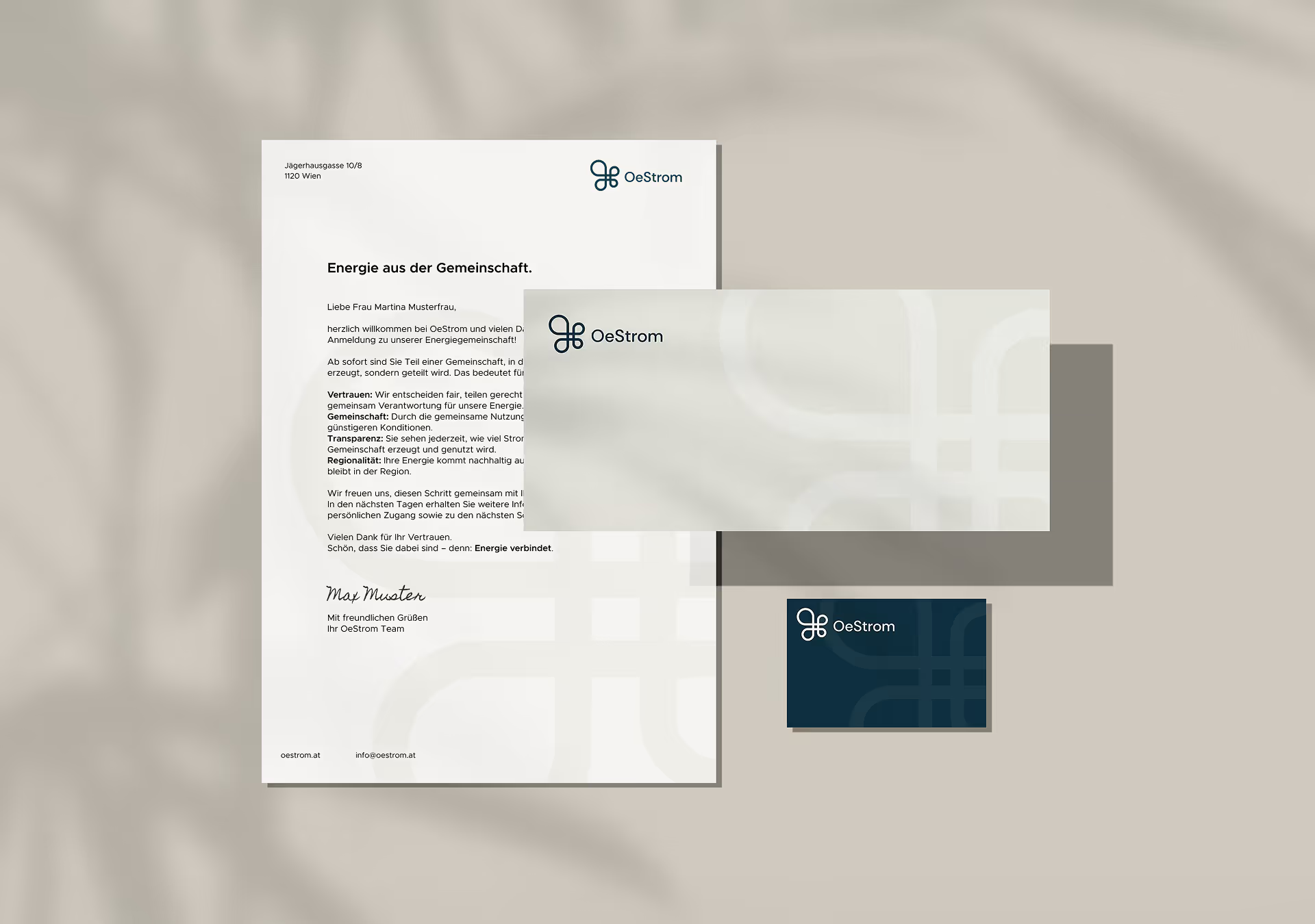
At the center of the branding process was the creation of an accessible, high-quality, and minimal design system — crafted to build trust, foster a sense of closeness, and make the idea of community both visible and tangible.
The imagery gives the brand a warm, harmonious feel. The visual language highlights connection and exchange, while typography ensures clarity and guides users confidently through all content.
Weil Austauschbarkeit das Ende einer Marke bedeuten kann. Weil Haltung Orientierung gibt – für unsere Zielgruppe und für Unternehmen selbst. Und weil starke Brands länger in Erinnerung bleiben.
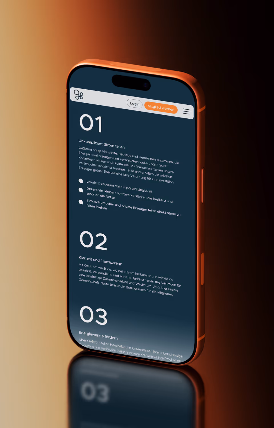
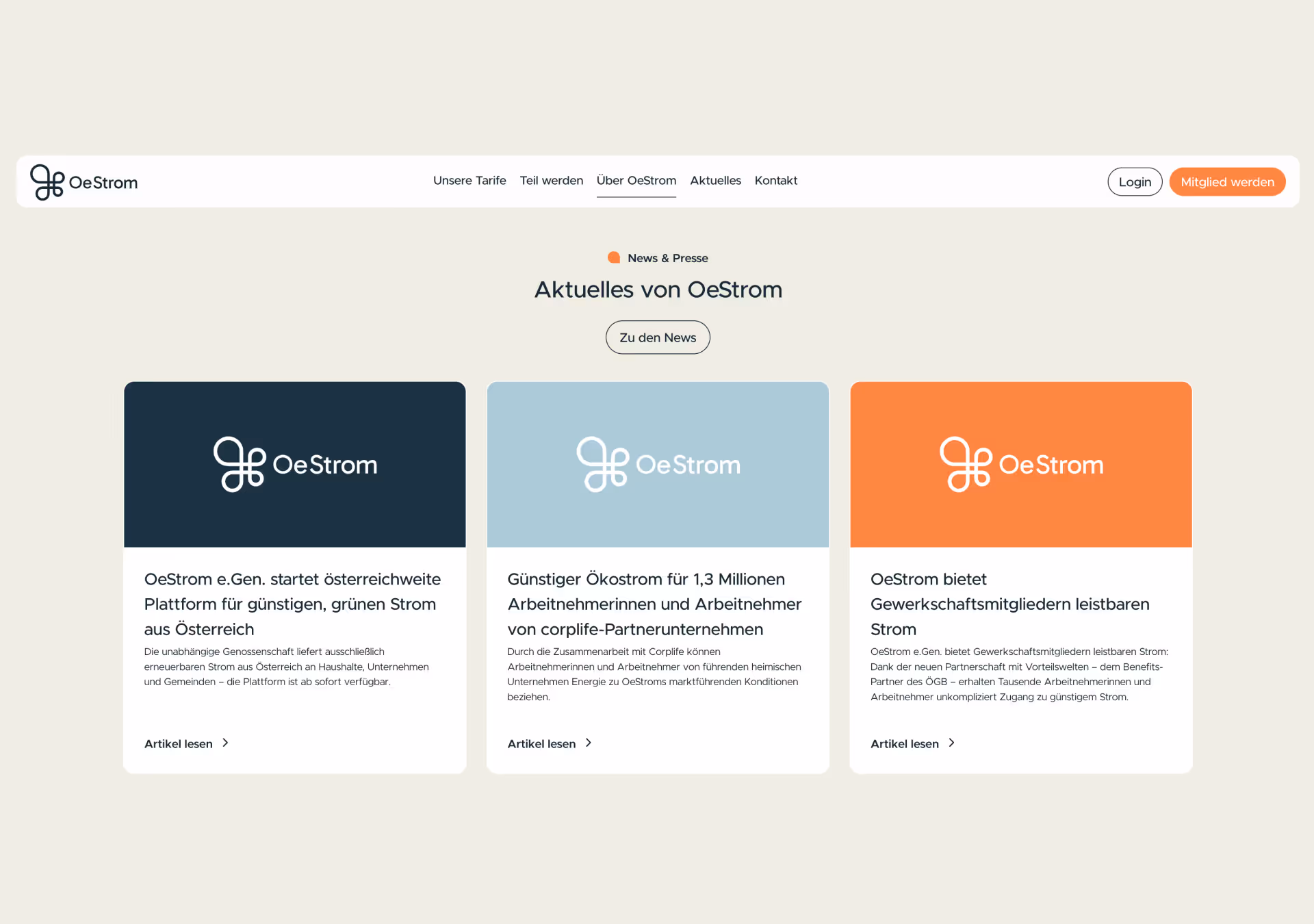
Building on this, we developed a Webflow website that extends these brand values into the digital space: reduced layouts, soft visual elements, and clear user guidance that reduces complexity and makes joining the energy community noticeably easier.