A year that creates impact — and a brand that amplifies it.
Brand strategy
Communication strategy
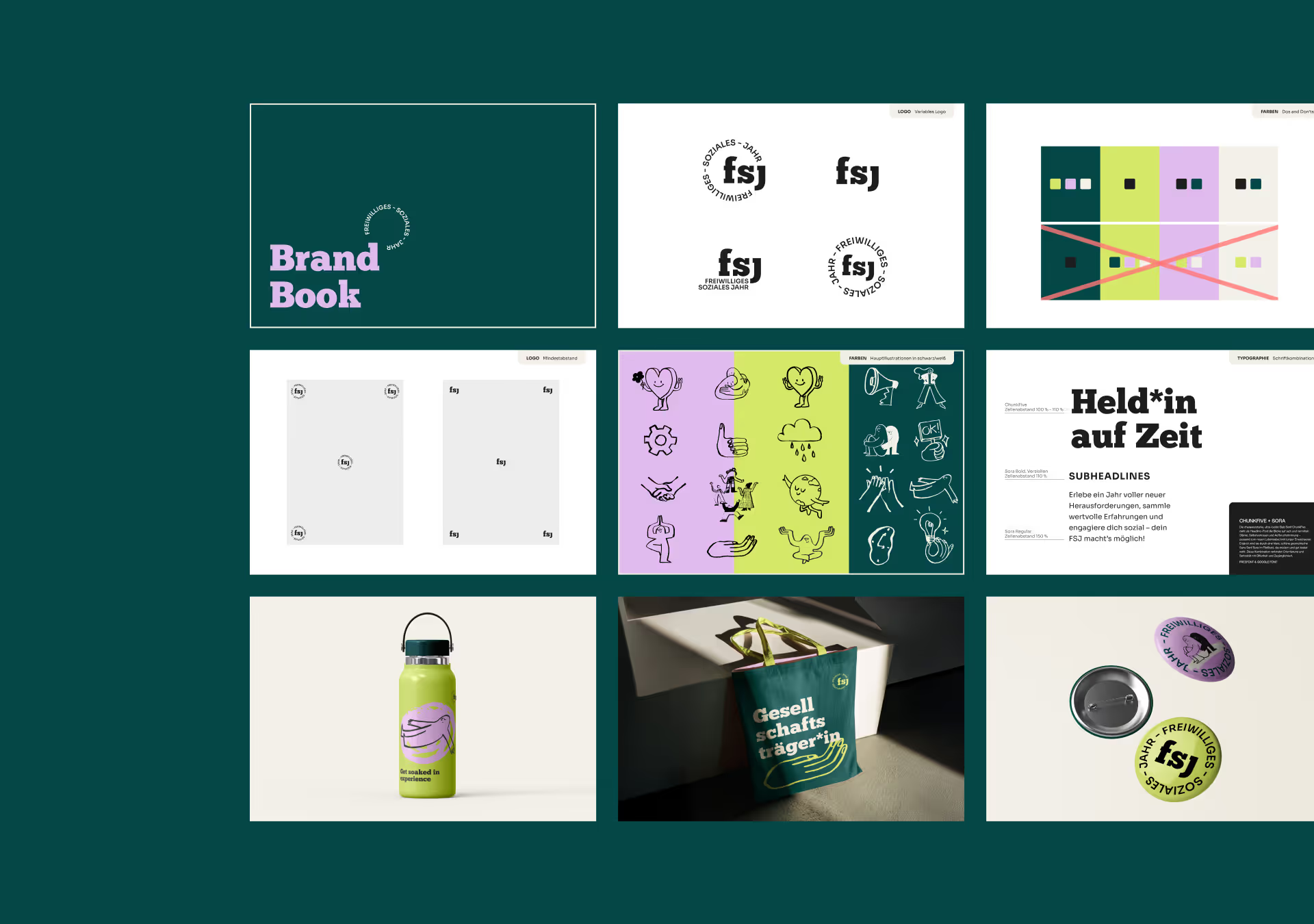
Visual branding
Logo design
Victoria Kozich
Visual Design
Stefanie Schönlieb
Account Director
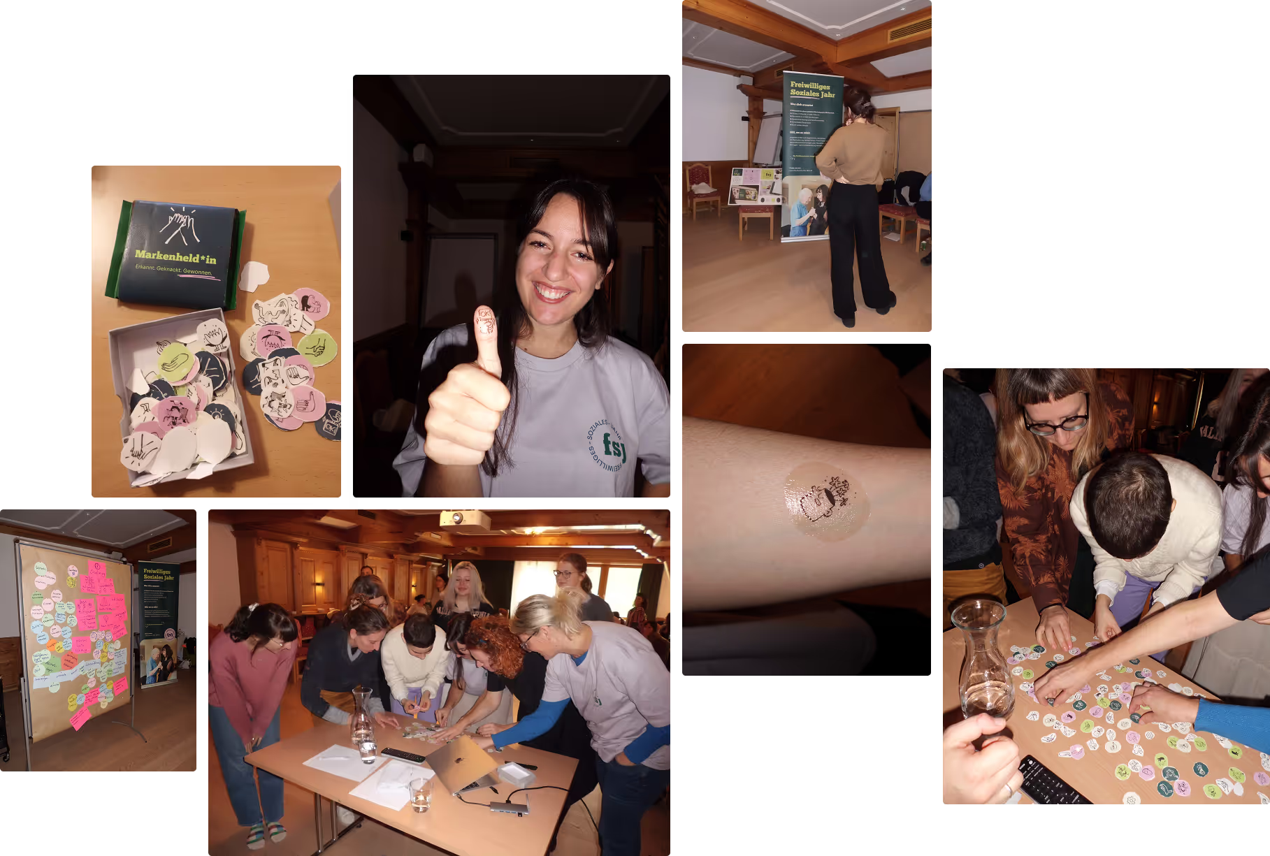
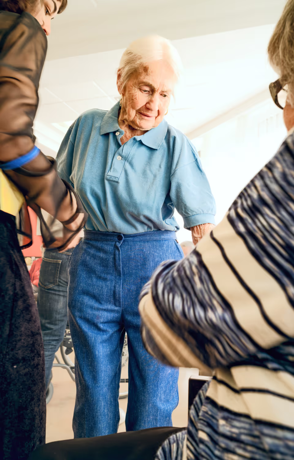
How to capture everything Freiwilliges Soziales Jahr (Voluntary Social Year) stands for - courage, connection, chaos, growing pains and those unexpected moments of joy - in a brand that previously felt more functional than heartfelt?
A defining adventure that demanded a branding that could keep up.
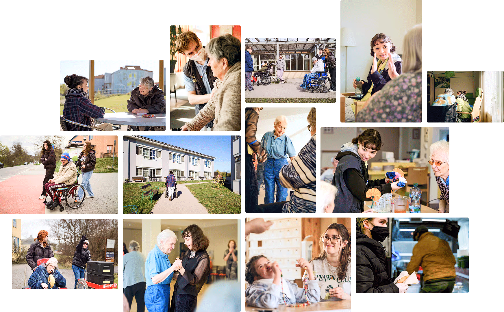
For many young people, the FSJ is the first step out of their bubble and into real life. It means responsibility, self-discovery — and emotions no checklist could ever capture. The problem: the public image looked more like a chore than the life-changing experience everyone talks about. We got the chance to change that.

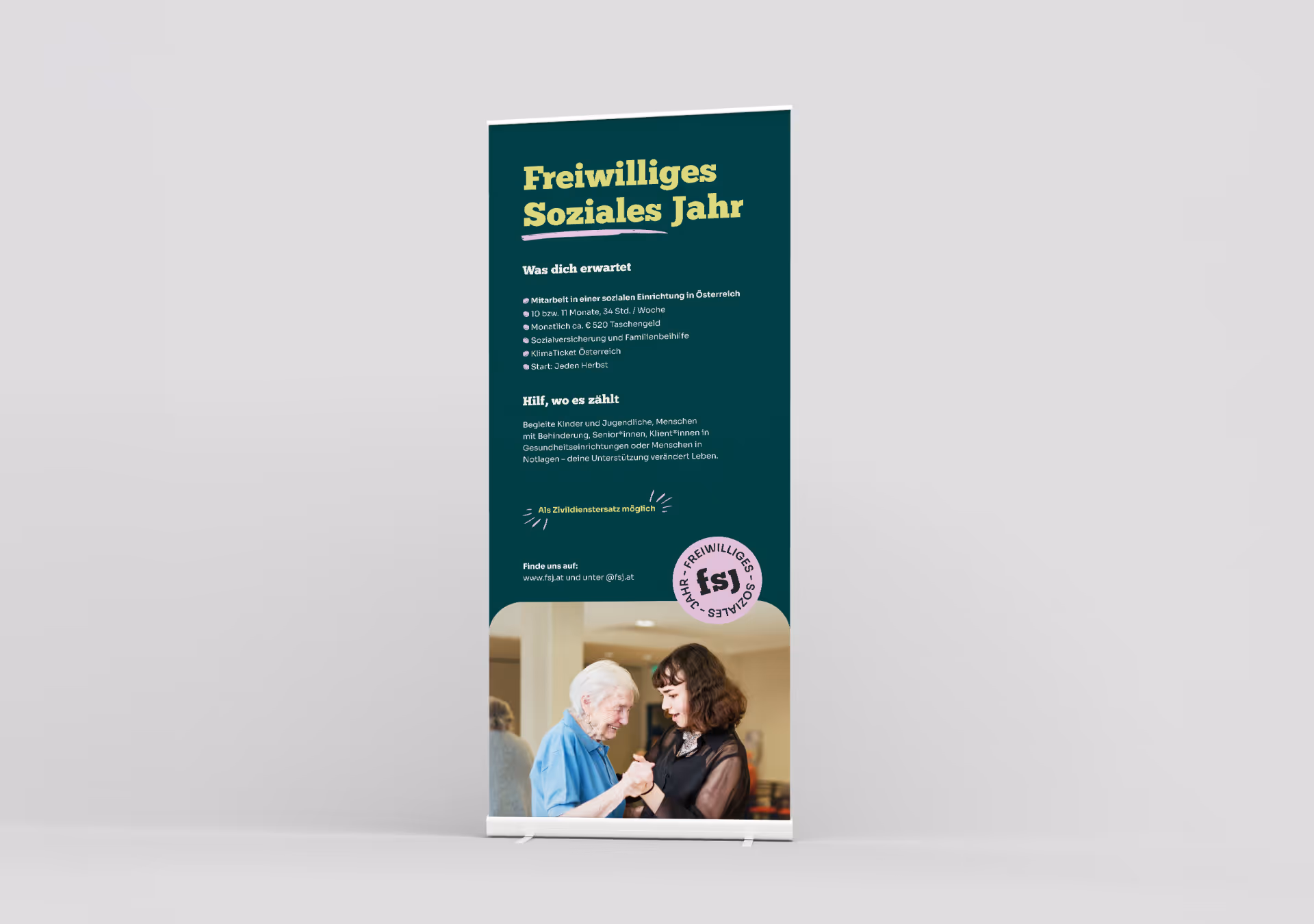
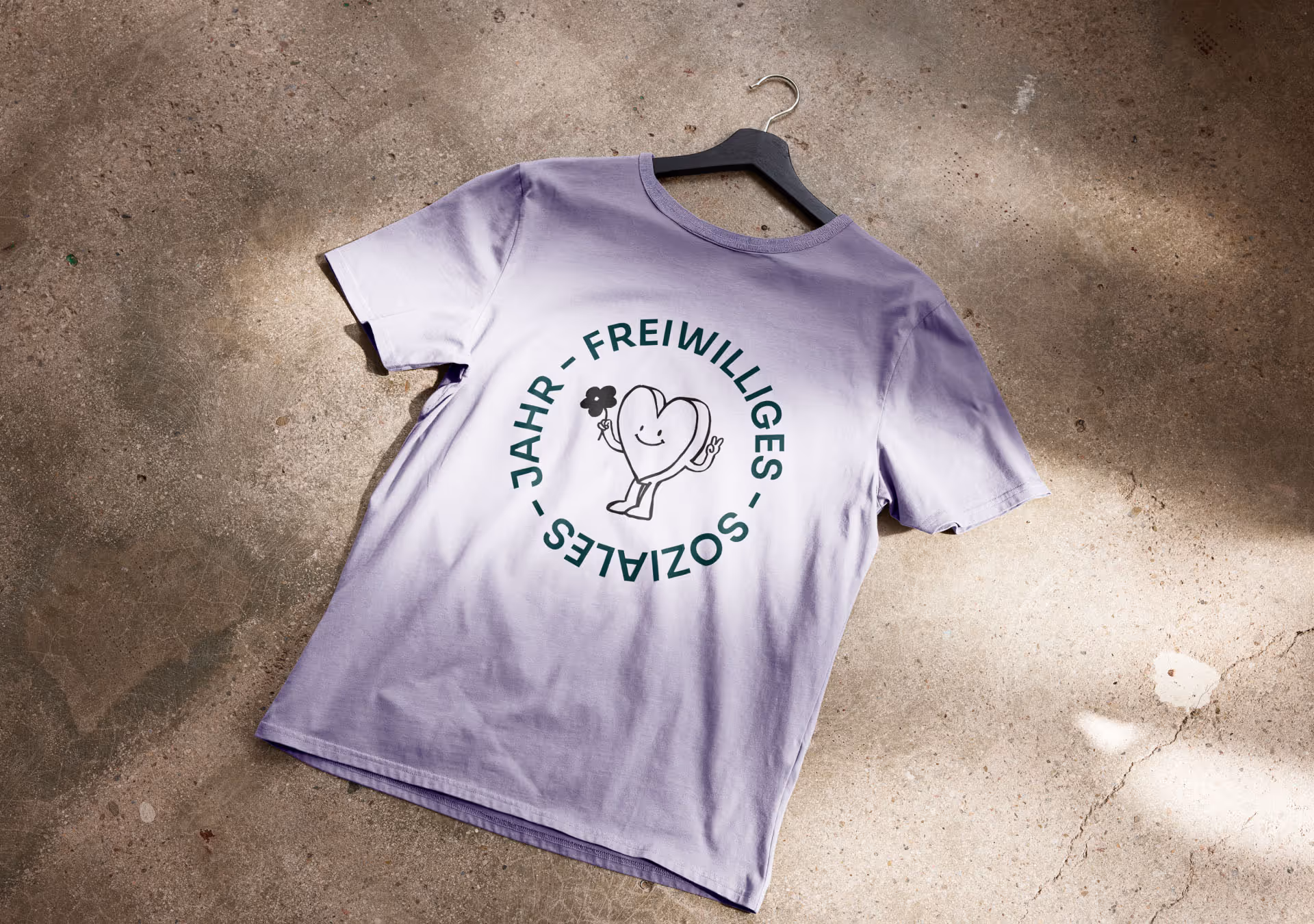
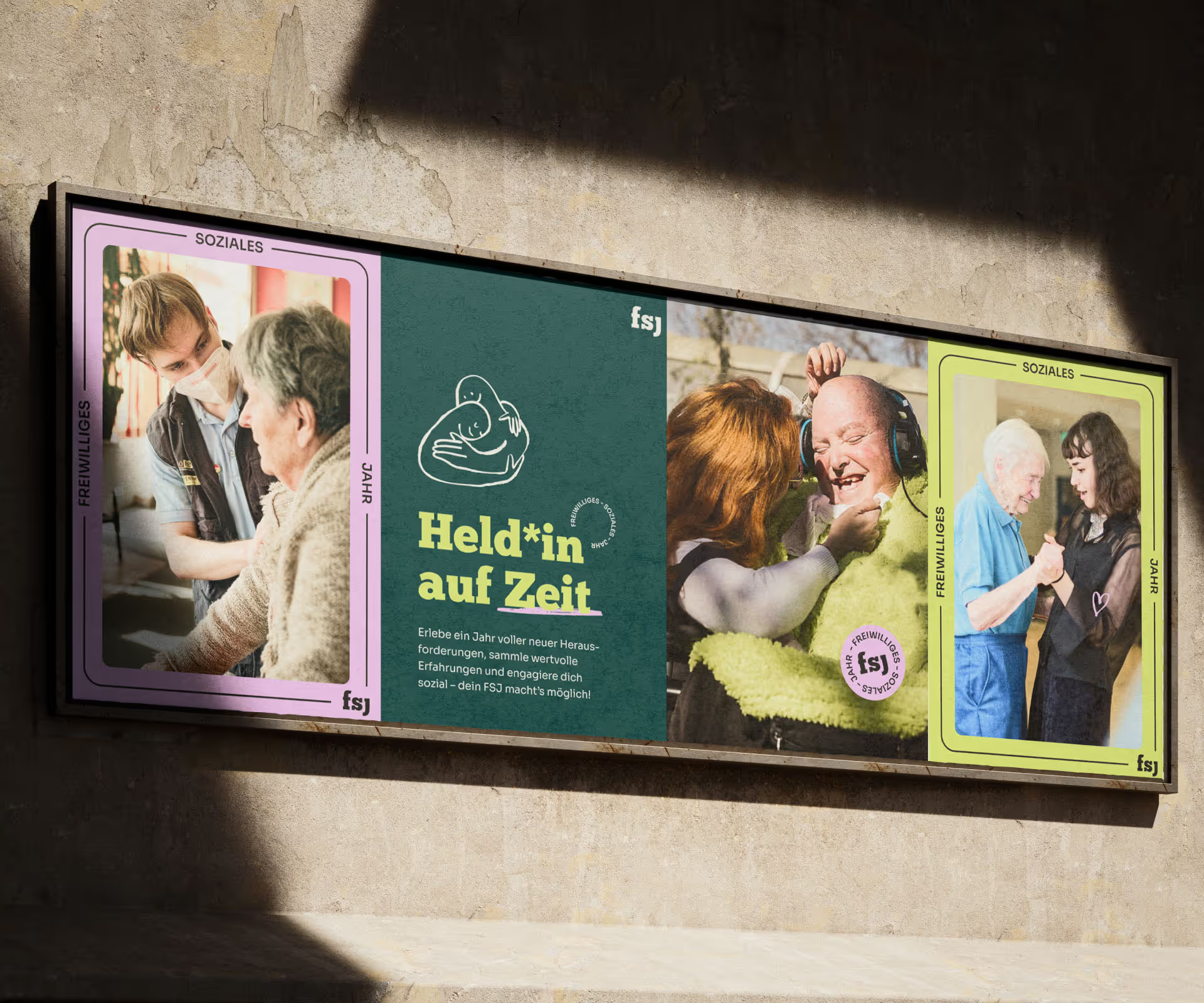
A social year full of emotions — packaged in branding that gives space to special moments.
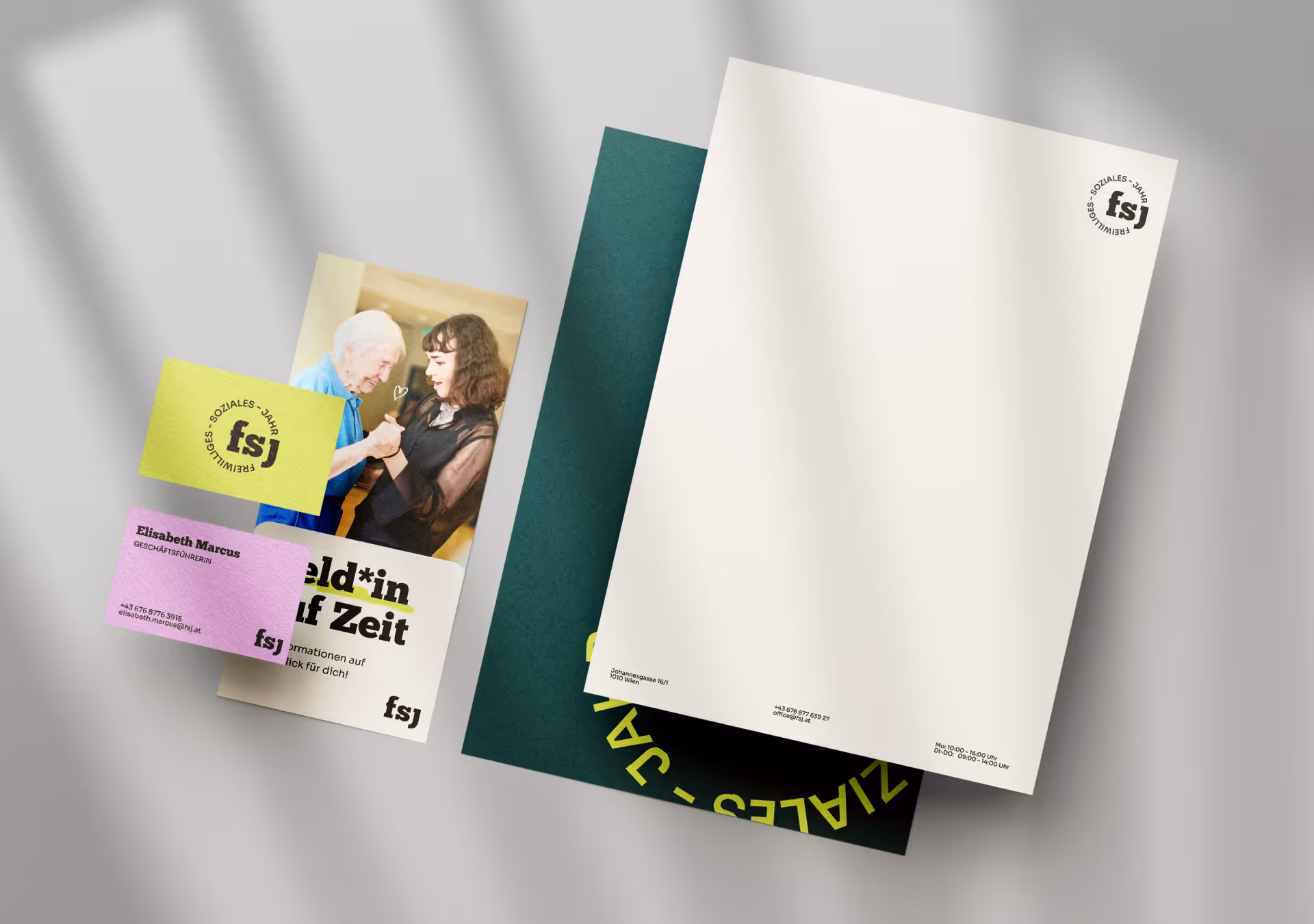
We didn’t ask what a social year looks like — we asked what it feels like. The result is a branding with more humanity, more movement and more “I’ll just try this.” The existing brand is expanded with a new core element: a frame that symbolizes orientation, development and the deeply personal journey an FSJ sets in motion.

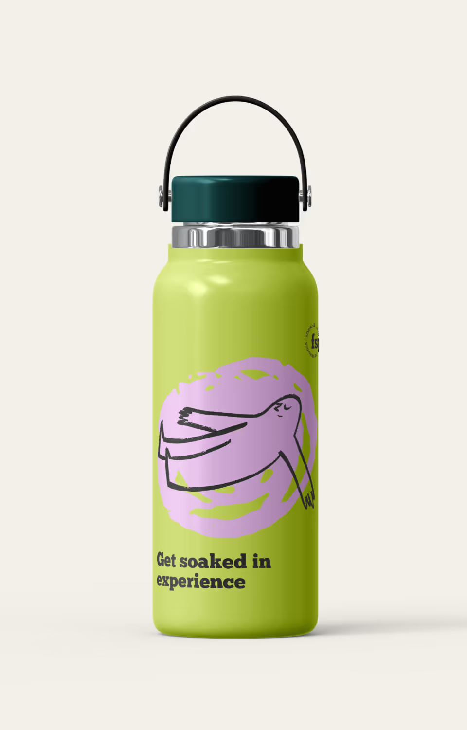
To that, we added colors that reflect the emotional spectrum of the year: forest green for grounding, apple green for new beginnings and lilac for the tender moments in between. The illustration style stays intentionally sketch-like and personal — like little notes from a year that truly leaves an impression.
Weil Austauschbarkeit das Ende einer Marke bedeuten kann. Weil Haltung Orientierung gibt – für unsere Zielgruppe und für Unternehmen selbst. Und weil starke Brands länger in Erinnerung bleiben.