Making shifted childhood realities visible
Branding
Creative Concept
Content Creation
Website
Anna Benda
Creative Director
Raphael Berthold
Art Director
Stefanie Schönlieb
Account Director
Rosa Zappella
Creative Concepter & Copywriter
Victoria Kozich
Visual Designer
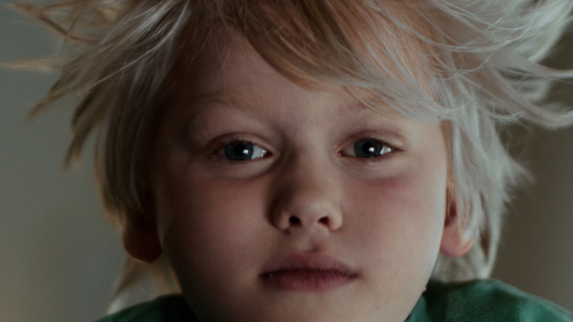
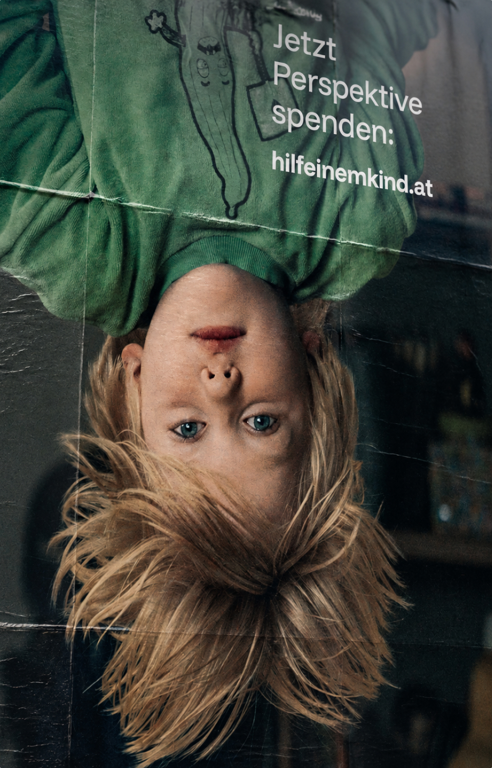
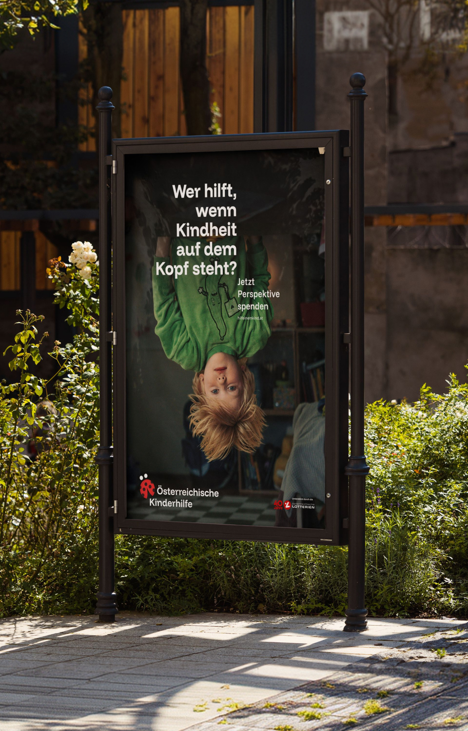
What happens when children have to take on responsibility too early, go without the things they need, and navigate a world that feels out of balance? For Österreichische Kinderhilfe (Austrian Children’s Aid), we developed a new identity that brings these distorted childhood realities into focus.
A visual identity that had fallen out of time after 25 years, no digital visibility, and no real brand to speak of – where do you even begin?
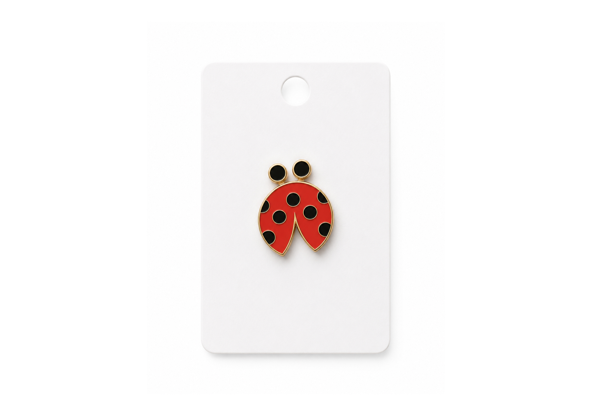
Right at the beginning. The task was to create a brand identity that would establish the historically rooted ladybird as a distinctive brand element. It also needed a strong communication idea that could put child poverty at the centre and remain relevant for years to come. And finally, a website that would help build trust, support donations, and allow the organisation to grow and evolve flexibly over time.
We make visible what often remains unseen: how child poverty turns everything upside down.
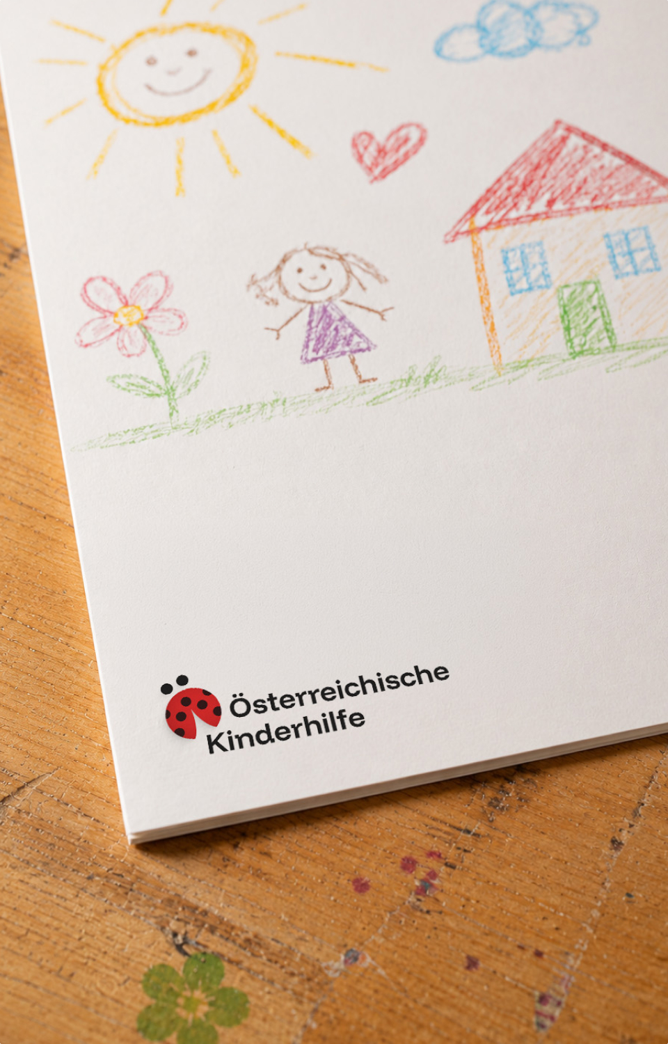
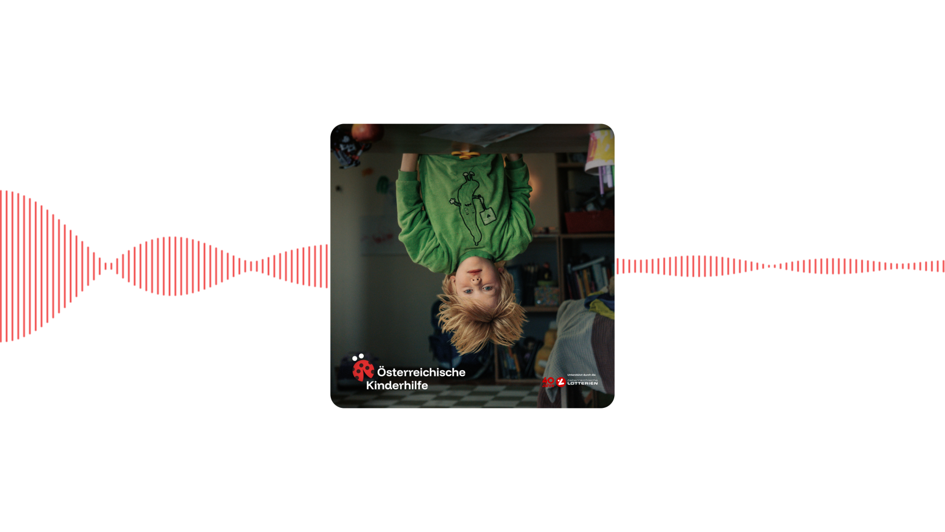
Our concept places the lived reality of affected children at the centre. A reality in which the usual order of things is turned on its head: roles, expectations, opportunities. We embed this shifted reality typographically into the brand – and make it visible and audible across different applications.

As much as we love the 2000s, it was time to bring Österreichische Kinderhilfe into the here and now.
The ladybird became a distinctive brand asset, while the idea of shifted childhood realities evolved into a visual and verbal system. Through typography, imagery and tone of voice, TV, OOH and radio show how children affected by poverty experience the very same world.