Putting a familiar brand in motion.
Logo Design
Visual Branding
Lena Keck
Visual Designer
Michaela Pleiner
Account Manager
A-NULL had strategically repositioned its brand: from a pure software company to a partner for knowledge, consulting and digital processes in the construction industry. Our task was to make this shift visible without throwing everything overboard. So we didn’t start from zero. We started with a zero.
How do you change a brand that isn’t supposed to start over?
A-NULL didn’t need a radical restart. The brand was too well established and too closely connected to its customers for that. At the same time, its existing identity no longer reflected its new direction: less focus on software, more on people, architecture and how digital tools are used in everyday practice. The new branding therefore had to do both: stay familiar while clearly moving forward.
Zero as the principle.
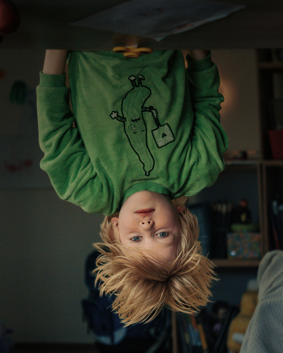
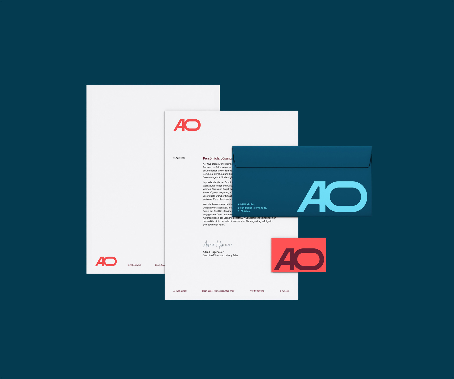
The central idea came from the existing brand mark: A-NULL stays A-NULL. But its form starts to move. We rotated the zero by 90° and made it the recurring principle of the new identity. It stands for a shift in perspective, movement and openness – while also becoming a strong visual element that runs through the logo, shapes, icons and applications. The imagery follows the same idea: fewer software interfaces, more people, spaces and what A-NULL is ultimately about – building and architecture.
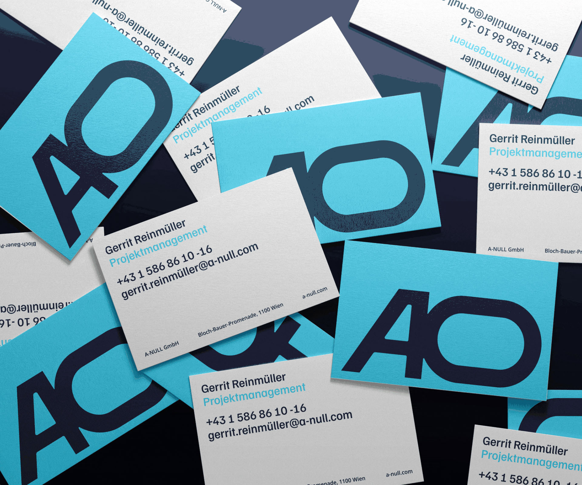
A small shift. A lot of movement.
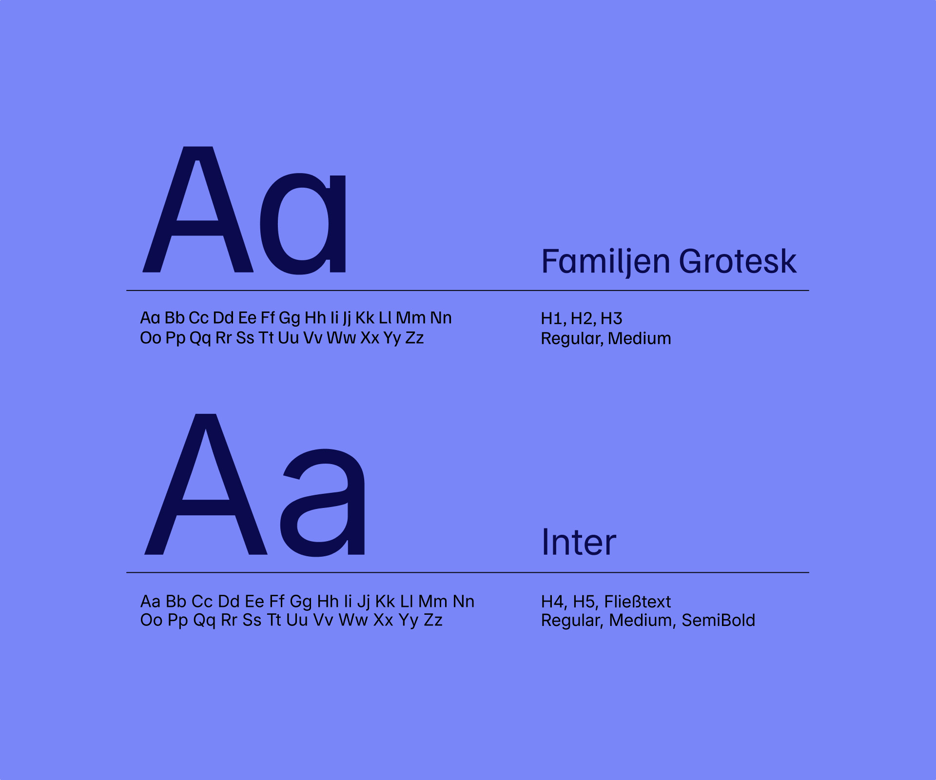
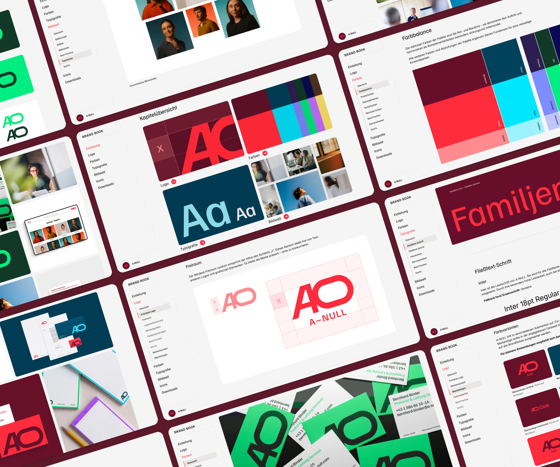
We turned the tilted zero into a visual system for the entire brand. We evolved the logo and extended the principle across sub-brands and formats, colour, typography, imagery and iconography. The system was then brought to life in initial applications across print, trade fairs and digital touchpoints, as well as in a digital brand book. The result is an A-NULL that feels familiar and new at the same time. Clearer. More dynamic.